INU, a new investment platform
Design lead on an eight-month engagement defining the user experience vision for a new mobile investment platform in the Czech and Slovak market. Led a design stream of up to 25 people across research, vision, prototype, and handover. Delivered the public product at inu.com alongside a complete design system.
Right-click any image to open it full size in a new tab.
INU was the largest engagement of my time at McKinsey, and the one I’d point to first when asked what good consulting design looks like.
The brief was open: a regional bank wanted a new investment platform for the Czech and Slovak market. Mobile first, simple onboarding, a value proposition strong enough to compete in a category where most products felt the same. They had no design team in place. We were the design team.
My role
Design lead across the eight-month programme. Team size at peak was about 25 people, including UX researchers, product designers, a separate design system specialist for the build phase, and a branding agency partner. I owned the design stream end to end, reporting directly to the client CEO on weekly progress.
The 2023 McKinsey evaluation captured what mattered most about this project:
“Your upwards communication and client relationship-building, specifically with the CEO, along with your practical demonstration of your deep skillset as a UX and product design practitioner as you built a new digital investment platform from the ground up, were particularly impressive.”
That’s the version of the work I want to remember.
What we did
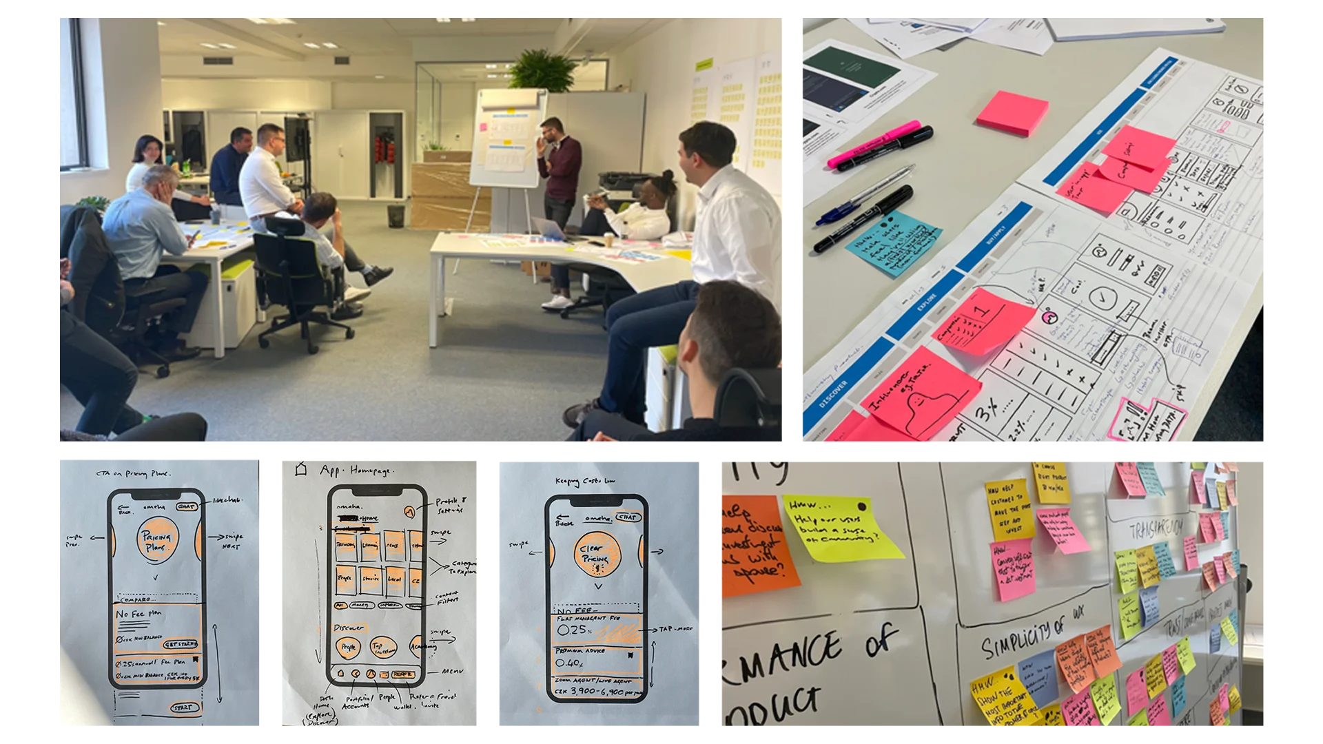
We started where good design always starts: with users. About 20 hours of one-on-one ethnographic interviews. Continuous testing rounds with a customer panel of around 30 people across the region. A clear picture of who saved, who invested, who didn’t, and what was actually getting in the way.
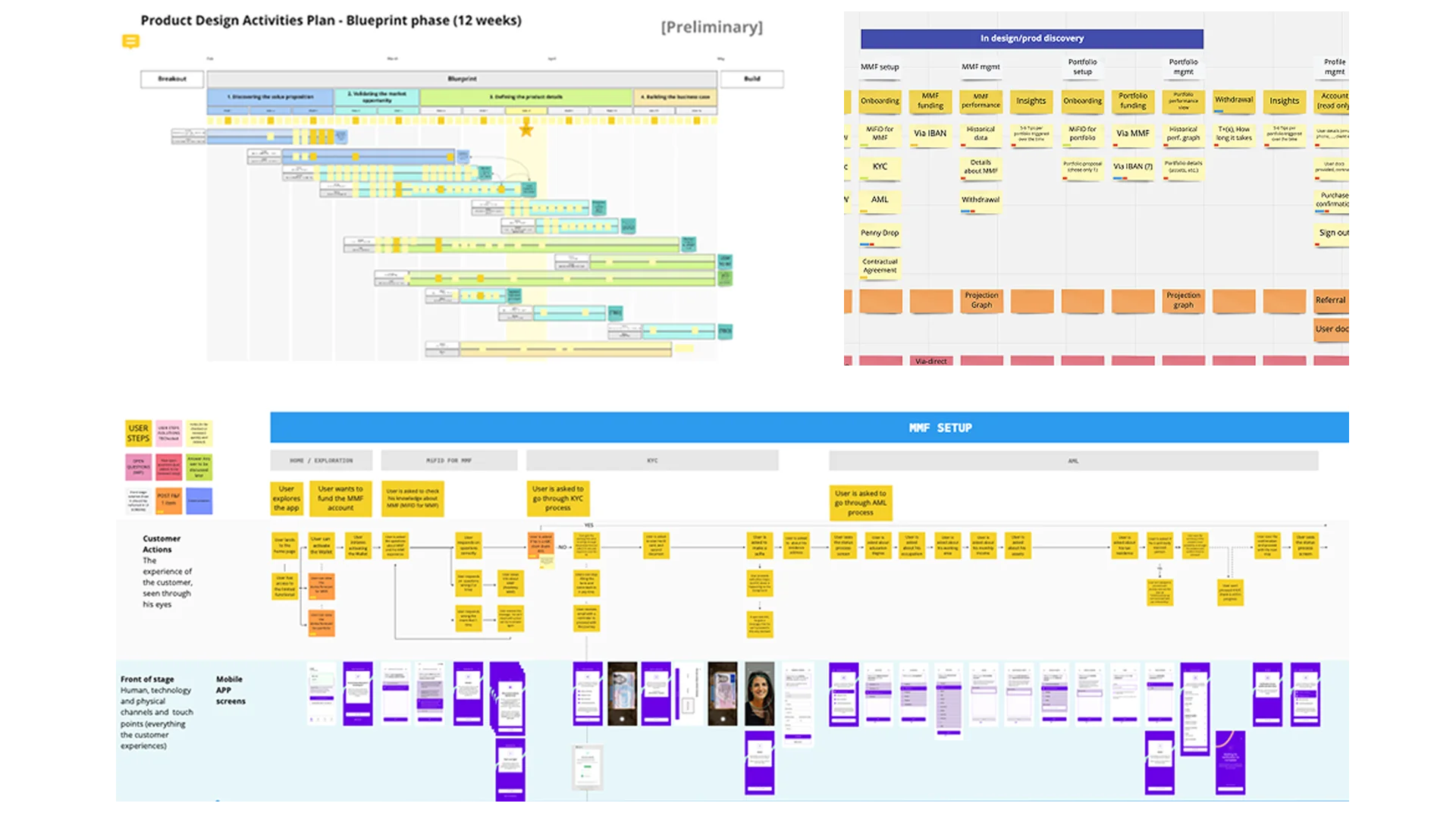
From there we ran roughly ten workshops with a broader client team to co-create and iterate on the value proposition. Design Workplan and roadmap. Value Proposition canvas. Service Blueprint. Customer Journey Maps. User Flows. Style Guide. Prototypes. The full kit, used in earnest rather than as deliverables for a deck.
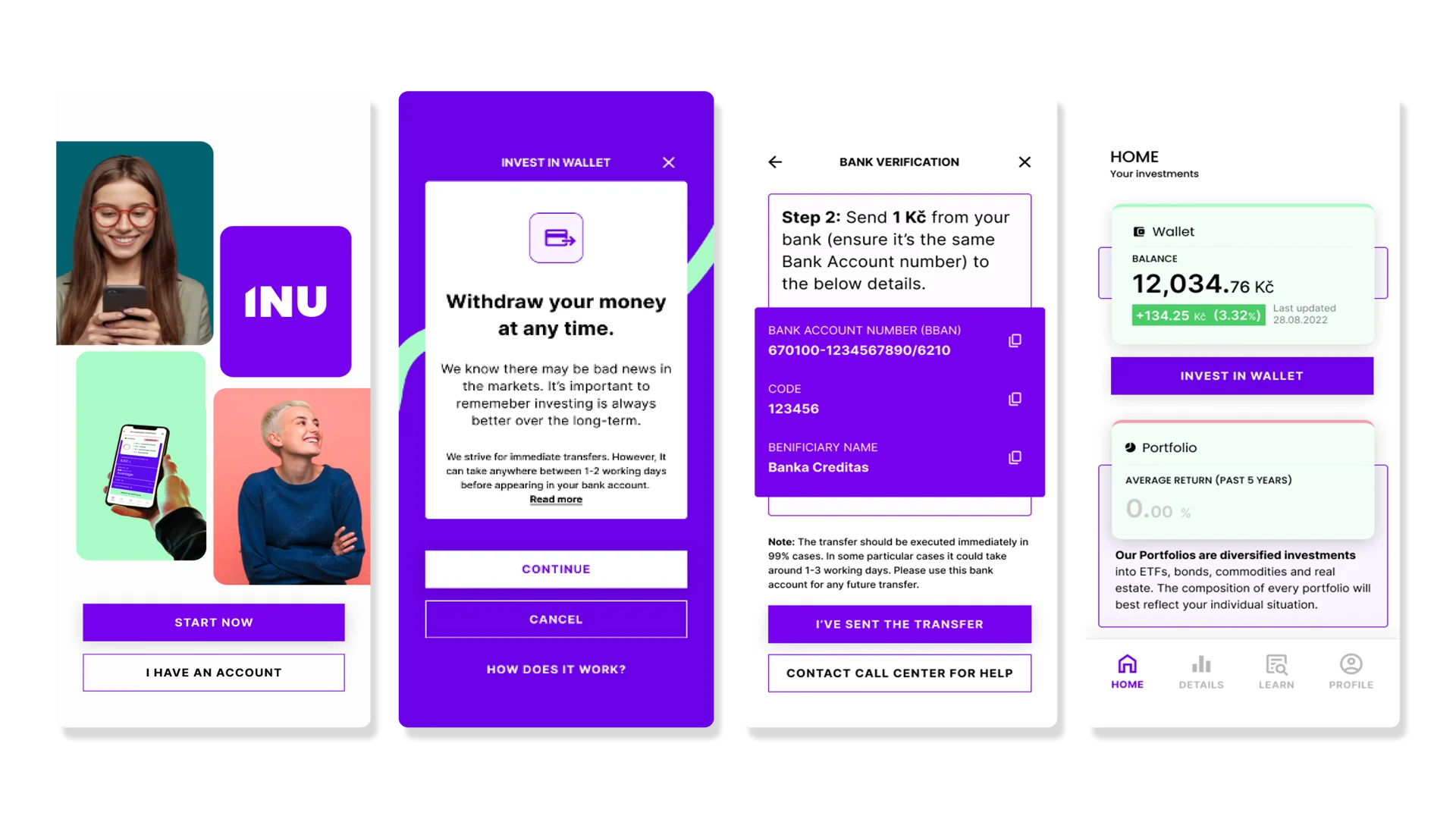
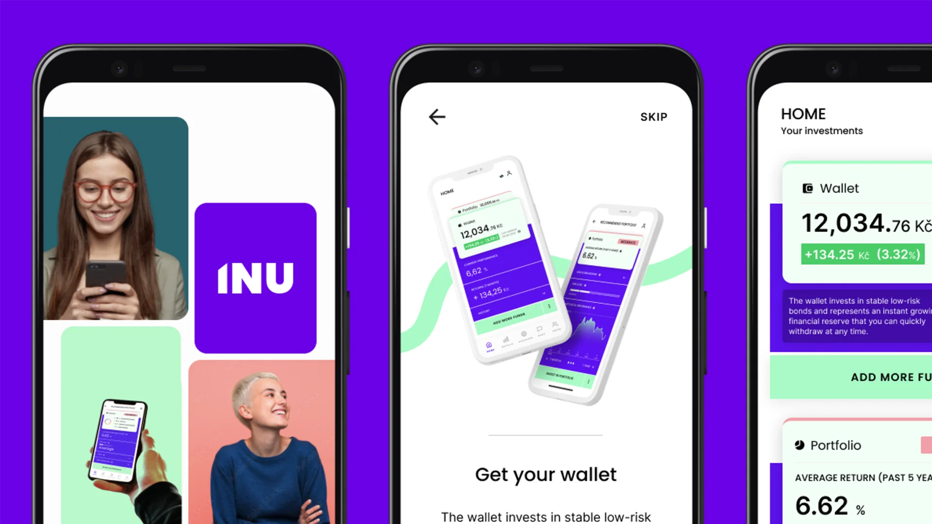
I did a significant amount of hands-on UX and UI design across the mobile app and accompanying website. Over 300 screens at launch, including prototypes used for live customer testing throughout the build.
Key artefacts
The design workplan and roadmap mapped the 12-week blueprint phase visually so the broader client team could see what was happening at every stage. The insights hub became a living document that summarised the data behind every design decision: the team always knew who they were building for. The service blueprint identified hand-off pain points across the customer journey before any of them showed up in the build. The user story map proved to be the single most useful tool for keeping stakeholders aligned, especially through the parts of the process where competing priorities collided.
The design system was built and handed over to the client team by a specialist designer over an eight-week period at the end of the engagement. Comprehensive enough that the client could extend the product without us in the room, which is the only real measure of whether a design system worked.
What shipped
www.inu.com is the live product. The app launched on iOS and Android with full onboarding, penny-drop bank verification, portfolio management, and a wallet flow built around the core insight that risk-aversion in this market is high but not unconditional. Users will engage with growth-oriented investment products if the path to first investment is short, transparent, and reassuring.
I also onboarded new designers throughout the engagement, established a structured way of working that survived the team’s growth, and kept feedback loops between product, tech, and the GTM team tight enough to ship on time.
What I’d say about it now
Building a regulated financial product from zero with a team you’re also assembling is a particular kind of difficult. The temptation is to optimise for the artefact. The discipline is to optimise for the decisions the artefact has to enable. Most of what I’m proud of on this project was invisible: the structure that made twenty-five people row in the same direction, the trust with the CEO that meant hard calls got made quickly, the documentation that meant the team didn’t lose context every time someone joined.